

core brand elements





Illustrations




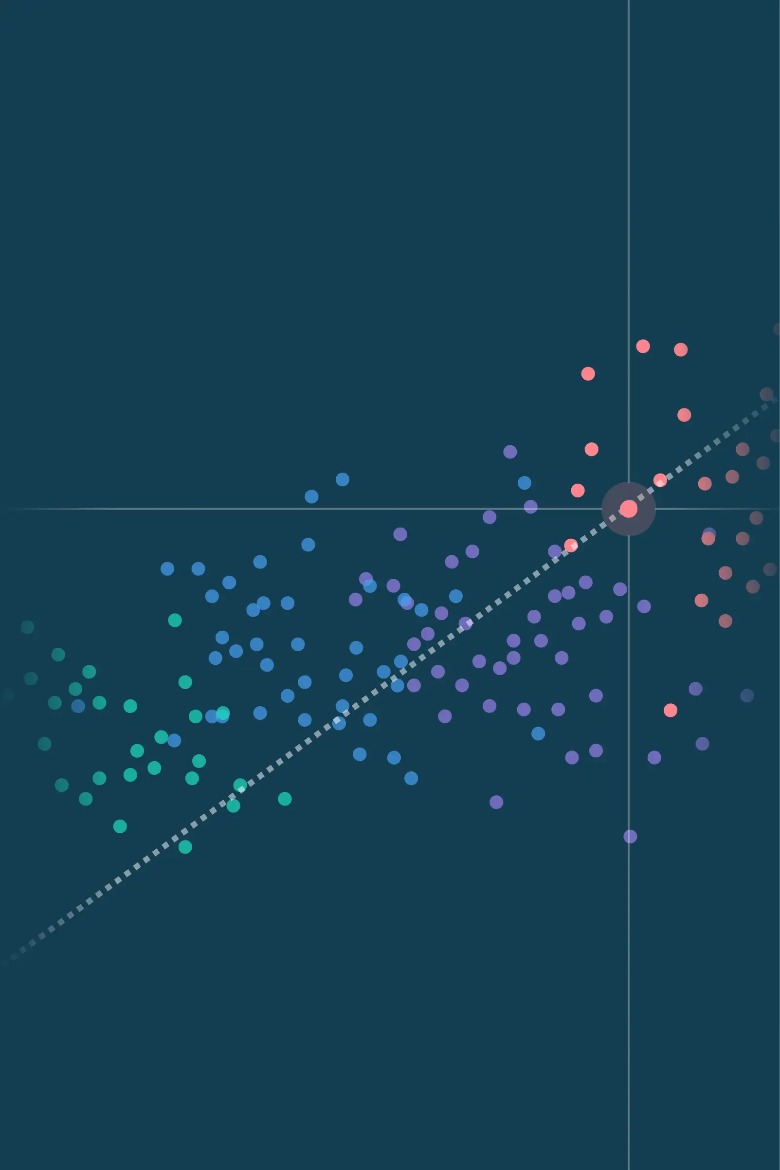


Texture - Mapping & meterology





The brief
ARC's existing brand had served the firm well, but it was built for a more technical, data-centric period in its history. As the consulting practice took on a more prominent role, the brand needed to embody a team that is proactive, attuned, intelligent and able to communicate clearly. The brief was to refresh, not reinvent: keep what 30 years of trust had earned, and sharpen everything else.
The strategic move
Rather than impose a new idea, we drew out one already implicit in how ARC works. The firm doesn't predict markets; it reads conditions, holds discipline, and helps clients stay on course. Charting safe paths gave us the organising line - speaking to the active management of risk, to the actual charts the firm is known for, and to both destination and journey. Four pillars sit beneath it: Strategy, Risk, Discipline, Independence. The structure now organises everything ARC says.
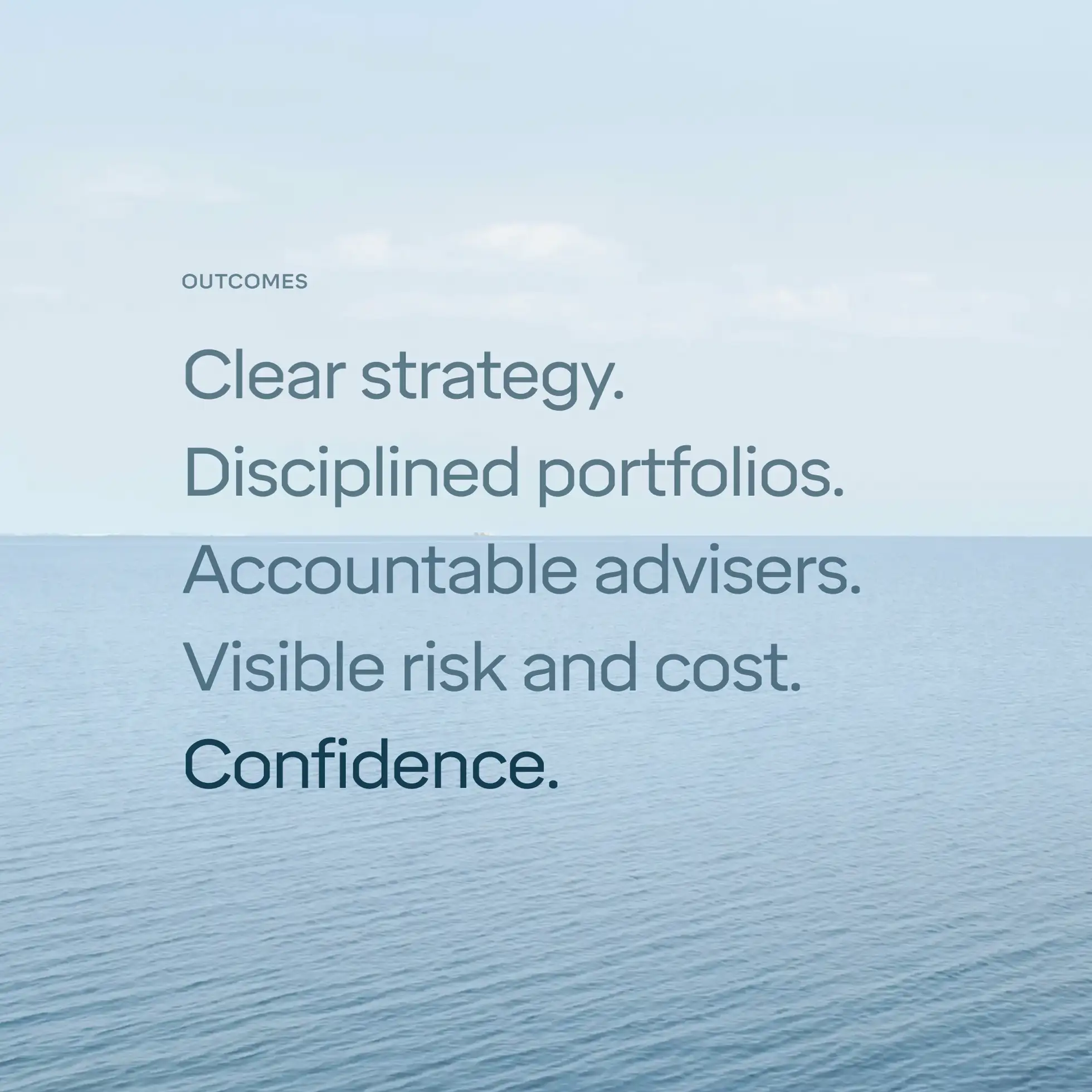
Outcomes
A new visual identity drawn from maps, weather data, isobars, wind maps and ocean charts (a world that mirrors how ARC's advisers already think). A type and colour and data visualisation design system that brings discipline to charts, tables and figures - turning ARC's analytical depth into something clients can read at a glance. Product design for a new digital insight delivery, giving clients a clearer, more interactive way into ARC's analysis. A tone of voice and five writing principles that translate the strategy into how every page, slide and chart gets made. Guidelines and templates designed so non-designers don't degrade the work over time. A website, decks, reports and client materials that finally sound like the team behind them.
My role